Sunday, 1 May 2011

last minute remake of final design

After much frustration with my final sketch I decided to redo the whole thing and make it more simple (shape and sound wise to prevent lagging, the cursed lagging)

I stuck with having a circle as the centre point of the interaction but instead of bouncing off other objects to make sound, when it bounces of the edges of the screen would make one single sound (sort of a futuristic bounce sound)

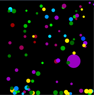
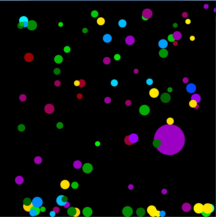
the interaction of this sketch is that whenever the main circle bounces off an edge, it will create a bunch of random coloured little balls which will appear whever your mouse is on the application.

Personally, I prefer this sketch much more than my original as it's more fun and simple (all those different  sounds and shapes would get annoying fast) and efectively simple (to prevent the horrible lagging and viral effects on my mind)

All I need to do with this sketch is to attach the sound file and upload it to Open processing as well as the R drive for marking (and I'll be done "Banzai!!!")

final design look

I finished the movement layout of my final design and got everything to move around randomly

this sketch consists about 30 random squares and circles of different size, colour and transparency with the big orange circle as the main attraction of the whole thing. the black background brings attention to the interloping shapes and the small details as well.

I just need to fix a few bugs, get the big circle to be in sync with the mouse and add the sounds to it all (each separate shape has it's own separate sound so there's alot there to do over the break)


I've actually begun to wonder if it's a bit too much since it keeps freezing while loading. Maby I should simplify it more so there isn't so much to load or just start again.

Thursday, 7 April 2011

Seccond to last Friday before the break

well, there's only one week before the break comes up and I realise that I still have loads of work to do. I'm playing around with all the things I can do with Processing as well as looking up examples ant tutorials in order to improve my present skills and meet the requirements.
I've been looking through all these personal tutorials over the net as well as the basic ones found on the processing website to give me ideas on how to code my final as well as give me tips on how to do awesome interactive things (since I suck at coding and all)
So far as to date I have failed most of my attempts with making the code interactive (I can only just make things move as it is) but I'll keep trying to get the interaction part right then move to adding the sound (one step at a time since I'm still slow at this) I'll keep trying over the weekend so I get a good frame to show on the last Friday before the holidays.

Monday, 4 April 2011

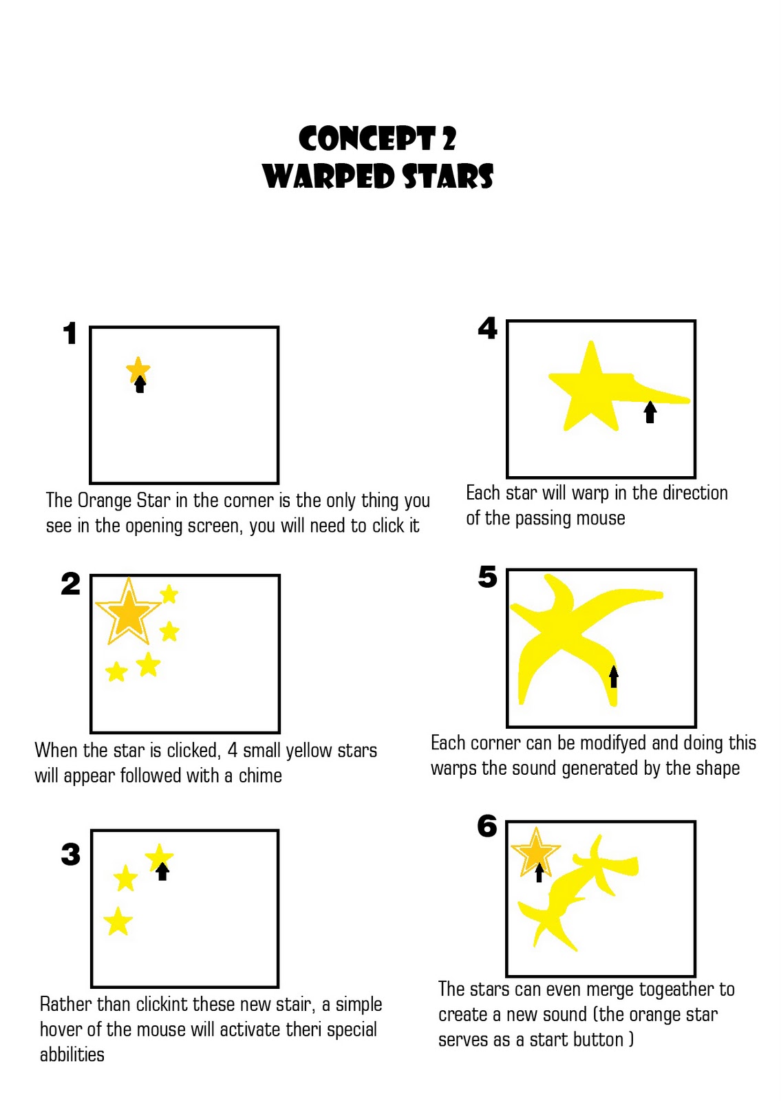
concept 2

Well this is my seccond concept (I know that my first isnt up yes and I'm obsesed with presentation) after this I'm going to start expermenting with simple code and expand it to get some of my own results I could use for my final.

Monday, 28 March 2011

Project 2 - Getting started and music inspiration

Well it's now the start of the second project for "Creative Coding" and I've started off by searching through my Techno music for inspiration. I actually find techno music rather relaxing as it seems to create an image in my head (regardless of lyrics) so to start off, I chose a few songs to share as my first step of finding inspiration towards my storyboard and my final sound to the interaction coded design..

my first music inspiration is the theme music for two characters from a chibi anime series (which I better not name)
I really like the beat this song offers as it's very easy to move to. every time I listen to this song I get the image of almost rolling and jumping (have to forget what the song is from to get a non predigest image though) the layering off all these different beats is also a huge inspiration to how I could do the sound  for my final with the visual interaction.

My next music inspiration is the theme music of Seymour (one of the "bad guys") from Final Fantasy X
The way the tempo is raised with layering of different sounds is very cool and really inspires me with the idea of creating shapes, each with their own sound layering on top of each other as they are added, creating a techno melody.
I also used this tune as part of the same inspiration (as it's also scales and layers of sounds)
This tune is at the start menu of almost every single Final Fantasy game ever but I find the older versions more inspiring as I want to go for a techno sound to keep the overall design linked to its computer creation.


Monday, 21 March 2011

Reflection

After this assignment I have learned that I really need to take the time to learn everything about coding since I still don't understand everything I did with my finals (I just kept referring to the references)

I have decided to practice coding and read the language dictionary in my spare time during this short break between this assignment and the start of the next "transformation" as well as durring the weekends.

I have also been told that I should work on reducing the ammount of text in my blog entries to make it easier for the markers (that's right, I'll try to make it easier for you) but not skip on all the detail needed in explinations. I must admit that this is a re-occuring problem of mine with over-describing all my works and being unable to simplify everything so I really will try.

To end it all off, I would just like to say that I still have a lot to learn in order to get the skills required for this course and not just rely on dumb luck to get results worthy of submission. I will try to improve my skills and myself to match this course and this University.

Sunday, 20 March 2011

Final Wallpaper Designs

well, it's the end of the first assignment for Creative Coding and I must say that even though I am still completely hopeless with Processing, I am very proud of my final four designs.

I experimented with contrast and colour to express my "theme" of illusion (seeing a different thing in the picture every time you look) and discovered that fire tones (Red to Yellow) stood out the most and captured you eye from afar (good for having the design on the wall no?) and decided to use those tones along with the ever old winning combo of Black and White.

I used the ideas from some of my drawn concepts (see previous blog)  but mainly used the idea of using curves to create borders for squares and began expanding with Ideas, all the while making sure they weren't too different from each other in order to keep them a set of four.

Now since I still get easily confused with all the coding language my designs are rather simple looking in both code and image, but I actually discovered that simple is very effective and just work with what you've got (you may get a splendid surprise)

the first of my four designs was personally the hardest (and the longest) to do as it meant making a solid blueprint from scratch (but I could use it as a base for the other three so it was good to get it done) after looking through the references and experimenting with different effects with curves I decided to use a "bezier" command and create a solid 8 shape, despite the fact that all the drawing commands are these "bezier's" it was a rather difficult shape to control so I decided to keep it  constant in all four designs to see the different effects I could obtain with different formulas. I used seperate commands to get the colour gradient since I completely frogot how to do the lurp thing so experimenting with different colours was rather anoying, I tried purple and blue tones first and despite how beautifull it looked, I wanted the image to wow the viewer and make them stare at it repeatedly. I also tried multi coloured but the overall design was too busy and rather putrid (pluss it gave me a major headach to both look at and create) In the end I decided to go with the fire tones (not just cause orange is my favourite colour mind you) which made the entire design stand out from the black and almosed forced you to try and decifer what it really was. The final touch was adding a bit of a hidden white line in between each shape to give it a 3-D look when you look at it from a cretain view. It also makes it look rather unique and adds to the changimg image.


The seccond of my four designs was much easire to do since I just used the code from the first and modifyed it from there (it made it easier on me to keep them as a set of four) I experimented with the different limmits I could get with these "bezier" shapes and created a kind of grid of red and black which I faded to allow the illusions continue. I also increased the white and played with the sizes and arangements of all the leftovers which created a kind of cherry shape pattern. It may be a big difference from the first one save from the white stripe over the black, but I keeped the colour constant to keep the bond between the designs.


Now the third design was rather tricky to get as I expanded on the whole grid look while keeping a bit of the illusion look to it. I decided to try more bold shapes to create a grid around the black. Each colour can be seen clearly and the fading on the white has decreased a bit to reveal a shape within the overlay. I wanted to keep using the same colours all the way through. Most of the illusion feel look may be gone but it still keeps that whole image hidden within feel while going more into the grid look.


My last design expanded on my origional concept and used all the red tones as "shadows". the shaping resemples that of some basic 4-sided flower designs while keeping that whole image within an image look. 
 I know that latter on I will be able to do better designs as I get more acustom to this new software and language but for now, I think I did a prety good job for a newbie (not the best ever but I'll take it)
I hope to improve and learn from all my expermients and mistakes 

 P.S - for some reason the PNG files didnt want to load on here so unfortunatly it's just J-peg files for now, I will upload the PNG files once I fix whatever is wrong or just give the files directly.